ftrprf briefed us to create a new brand illustration style for their social media channels to be used in their Impact Special articles, which will run in conjunction with a newspaper print campaign.
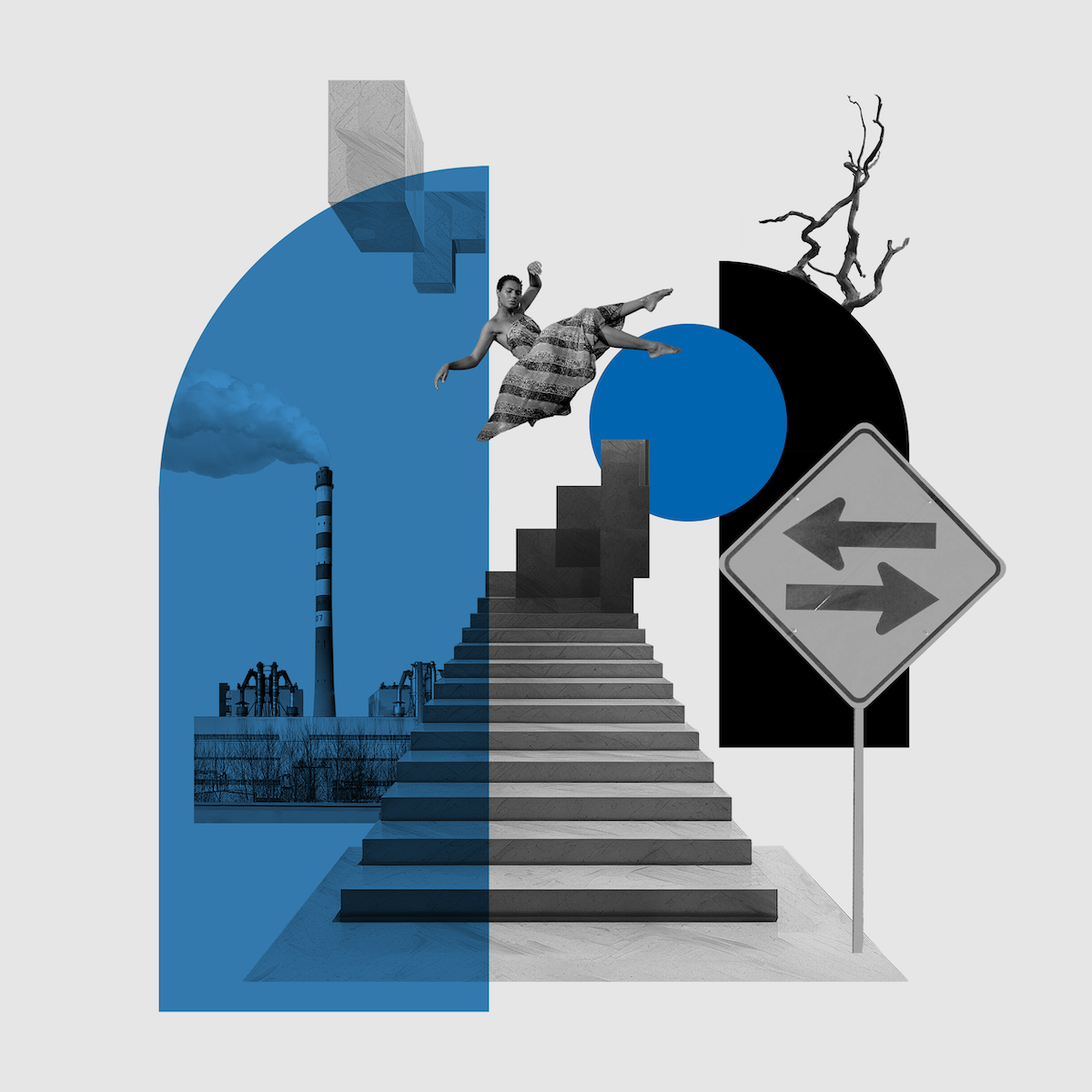
Inspired by artists like Hannah Hoch and John Stezaker, we wanted to create something visually captivating that also aligned with ftrprf’s brand philosophy. Which is a blend of modern sustainability mixed with playfulness.
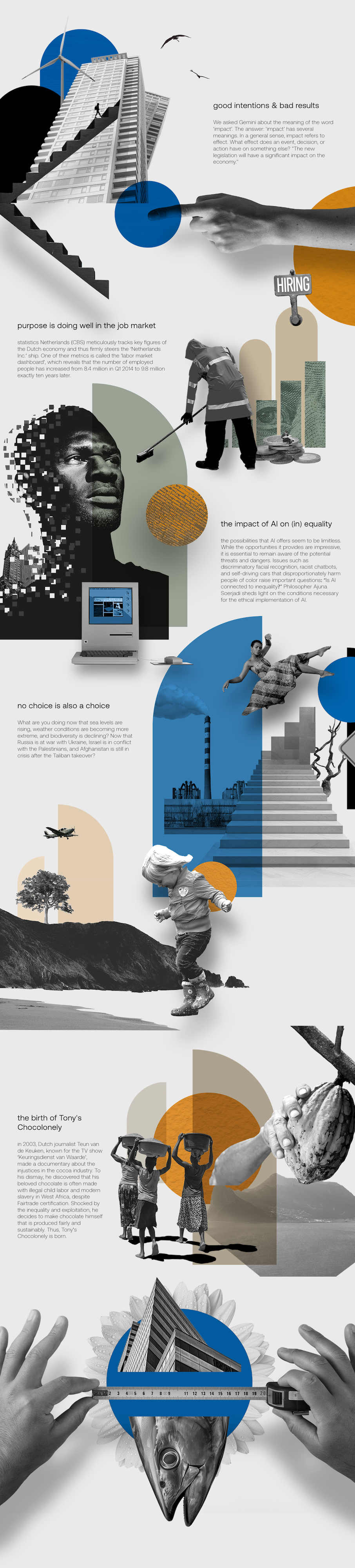
We aimed to capture the essence of each article with slightly abstract collage-style artwork. We tried to depict each article as a visual story, usually with a main focal point or protagonist and the rest of the elements playing a part in the narrative.
Solution
From the initial concept and key visuals to the final artwork we were in constant contact with the ftrprf team, to make sure every post reflected visually what was written in each article. Our goal with each visual was to capture the article as if you were reading it from the visuals alone.
We managed to create a new, fresh visual approach that encompasses ftrprf’s brand pillars and philosophy.